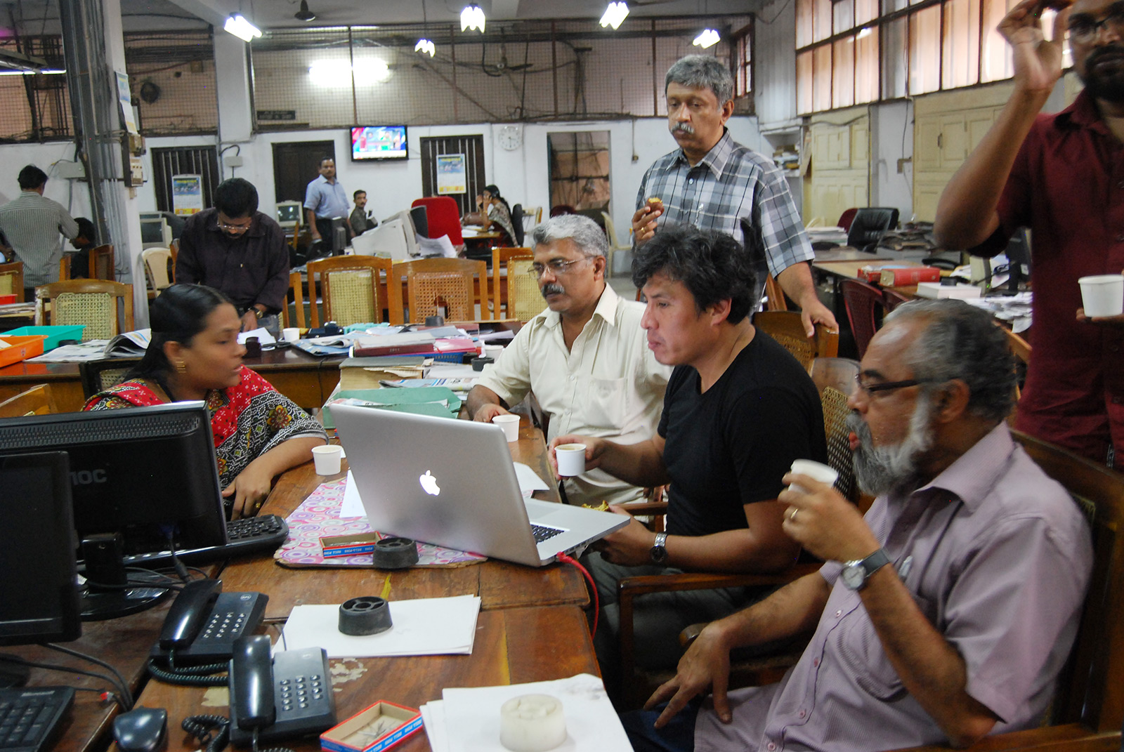
When I arrived in Bangalore to hold a two-day workshop for 22 Indian newspaper professionals, the question on everybody’s mind was: how can local newspapers in India realistically start integrating graphics in their news coverage? While some of India’s larger newspapers such as The Times of India and Malayala Manorama have experience with visual journalism and infographics, most local papers feature relatively few graphics, often due to a lack of trained staff and resources. (Picture is from Kerala Kaumudi the Indian Newspaper of Malayalam Language from Thiruvananthapuram)
To come up with an answer for my workshop attendees in Bangalore, I thought back to when I was working at one of Peru’s local newspapers. The thing I learnt there is this: you don’t need an awful amount of space for news graphics to work. Some of the visuals we produced at that paper were no more than a column wide and a few inches deep. Here is an example:
In the end, there are plenty of simple, cost-effective ways to bring graphics into daily news, as long as there is someone who can boil down the relevant information to the bare essentials.
Speaking of bare essentials; the other topic we focused on was non-textual, non-verbal – in other words purely visual – communication. If you look at the graphic above, you don’t really need to speak Spanish to understand what happened. India has more than twenty officially recognised languages and an incredible amount of dialects. Therefore, getting messages across without the use of text is of great importance to visual journalists there.
All of which reminded me a lot of a workshop I did at The Economic Observer (Beijing) about a year ago. Interestingly, judging from these two trainings, it seems that journalists in China and India share a lot of the same questions and concerns regarding the value and practicability of visual journalism. Just like in India, China’s regional titles are emulating market leaders and looking for practical ways of bringing more graphics into their coverage. Despite the cultural and linguistic differences, they certainly share an enthusiasm and eagerness to use more visual elements in their reports. I’m happy to report that things are looking good for infographics in both of Asia’s most populous countries.


