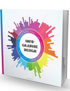
The other week something rather exciting landed on our desk: Choi’s Gallery’s new book, Infographic Design, a global portfolio of infographics projects, featuring five projects realised by us. 232-pages full of inspiration, including case studies ranging from the sober and technical, such as user manuals, to the quirky and playful, such as a timeline of Pink Floyd band members.
In the book, Choi’s Gallery somehow manages to capture a cross-section of the past few years of infographics design practice on paper; no small feat! Each entry is accompanied by a short project description, giving the reader a peak into what goes on behind the scenes at some of the biggest names in infographics. It’s a lot to take in and there are plenty of useful tips on things like data visualisation, visual journalism and the development of design concepts.
Here are a few sample pages from the book (including one of our Formula 1 spreads):
Great to see an ambitious book project come out as nicely as this. It is a highly recommended read for anyone looking for inspiration and information about infographics today.Having said that, it’s a real honour to have our work represented here.
The following five projects of ours are featured in the book:
Beijing 2008
With this project we were able to realise what is probably the biggest and most complex infographics project in the Arab world. We only had two months to complete it, which demanded even longer hours than usual from everyone.
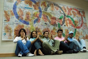
It was quite an experience working with an exciting group of talented people, who are passionate enough about visual journalism to go for crazy ideas like this one. In the end, we had 36 pieces, each published as an individual tearsheet poster during the 2008 Olympic Games in Beijing. Together, they make up one single mega-infographic, something like a giant wallpaper puzzle for sports fans.
Using techniques like drawing with charcoal and tea pigments, the team created beautiful illustrations of each Olympic discipline and we used the full wealth of historical data about the Games to embed each image in statistical context. The project was very well received and, thanks to Al Bayan’s forward-thinking management, it looks like we’ll be able to keep creating ambitious work like this for Arab readers.
Peru – A True Paradise for Birds
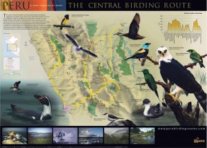
This is a guide to Peruvian birdlife for tourists visiting the country as well as birdwatchers and ornithologists all over the world. The guide consists of three posters detailing the north, south and central areas of Peru, with a focus on the migratory routes that lead different species of North American birds here in the winter months. Each map is complemented by photos of the various species that live in this part of the country as well as detailed descriptions of the different natural regions, national parks and eco-friendly destinations. Luis worked with the renowned Peruvian photographer Heinz Plenge to create this project, which took about two months to complete.
The final four
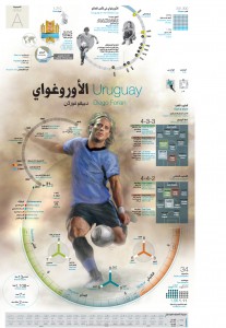
This special supplement was commissioned by Al Bayan newspaper as a preview of the 2010 World Cup. 48 full-colour pages were dedicated to an infographic guide to the beautiful game, a project that brought out the best in our multi-cultural team. The project gave us the opportunity to use the full arsenal of tools at our disposal: fine art illustrations in oil, Photoshop retouching, in-depth research, tables, graphs, lists, numbers, translation – everybody had to “click” to make this work, just like in football. At the centre of each piece was a hand-painted illustration of an athlete in action, surrounded by a barrage of insightful facts and figures in Arabic and English. Bilingual infographics require a very clear visual concept and this was achieved by selecting the most famous players for each country and tying them in with information about their national team. The idea was to provide football fans with a collectible piece of visual journalism, perhaps something to keep on the couch table throughout the tournament.
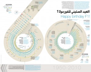
Happy Birthday F1
This 40-page full colour supplement was published to mark the 60th anniversary of the first Formula 1 race ever, which coincides with the beginning of the second Grand Prix at Yas Marina Circuit in Abu Dhabi, the capital city of the United Arab Emirates. The supplement begins with contextual infographics based on historical statistics about the sport in general and the Abu Dhabi circuit in specific These introductory infographics are followed by a series of team-specific broadsheet DPS, each with a detailed illustration of the season’s race-car model, shown at an angle from above.
The Formula 1 anniversary supplement was one of of our most ambitious assignments to date and took us three months to plan and deliver. As a huge F1 fan, this was also an incredibly exciting project to work on and completing it on time definitely felt like a high-octane race of sorts.
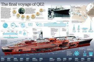
To mark the Dubai stopover of the iconic cruise ship Queen Elizabeth2 on her final voyage. The centre piece of the infographics is an intricate cross section of this impressive vessel, surrounded by facts and figures about its legendary history as one of the world’s most elegant cruise ships. QE2 retired from service in November 2008 and was brought to Dubai to be converted into a floating luxury hotel moored at the Palm Jumeirah. In essence, the infographic is based on comparisons between QE2 and and other memorable steel constructions such as the Eiffel Tower and the Burj Khalifa. It was published in Emirates 24|7, the UAE’s leading English-language business paper.

