After three intense days at the 2013 News Design Asia conference in Jakarta, I returned to Dubai with a head full of ideas and pockets full of business cards. Here are a few notes on what happens when journalists from all over Asia put their heads together:
The delegates
Journalists from Indonesia, Sri Lanka, India, New Zealand and China, among other places, made up the majority at the conference, all eager to get as much hands-on training as possible. Looking around, I was struck by the thought that the group was like the Asian continent itself: young, colourful and ambitious. Most of them, even the managers, were in their late twenties and thirties. Their passion, creativity and determination to succeed in their fields was tangible at every session.
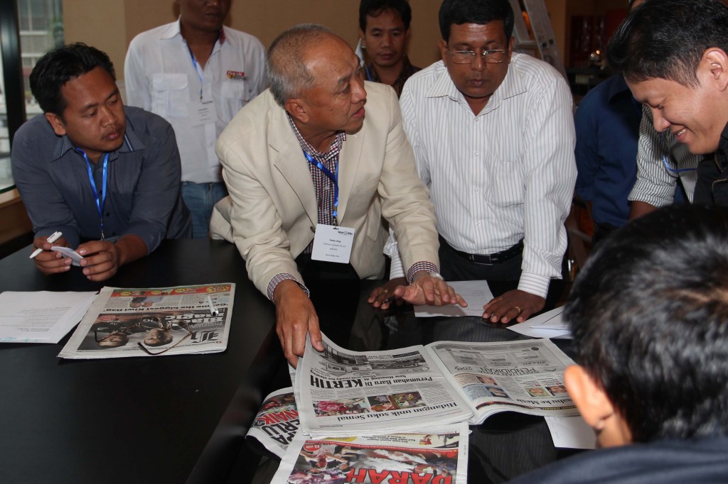
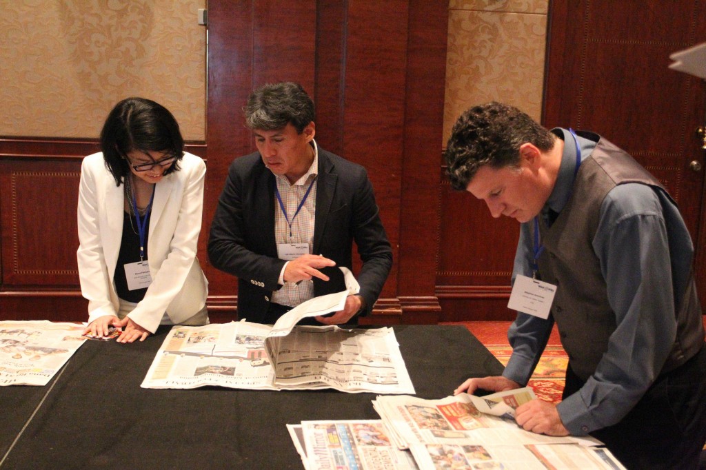
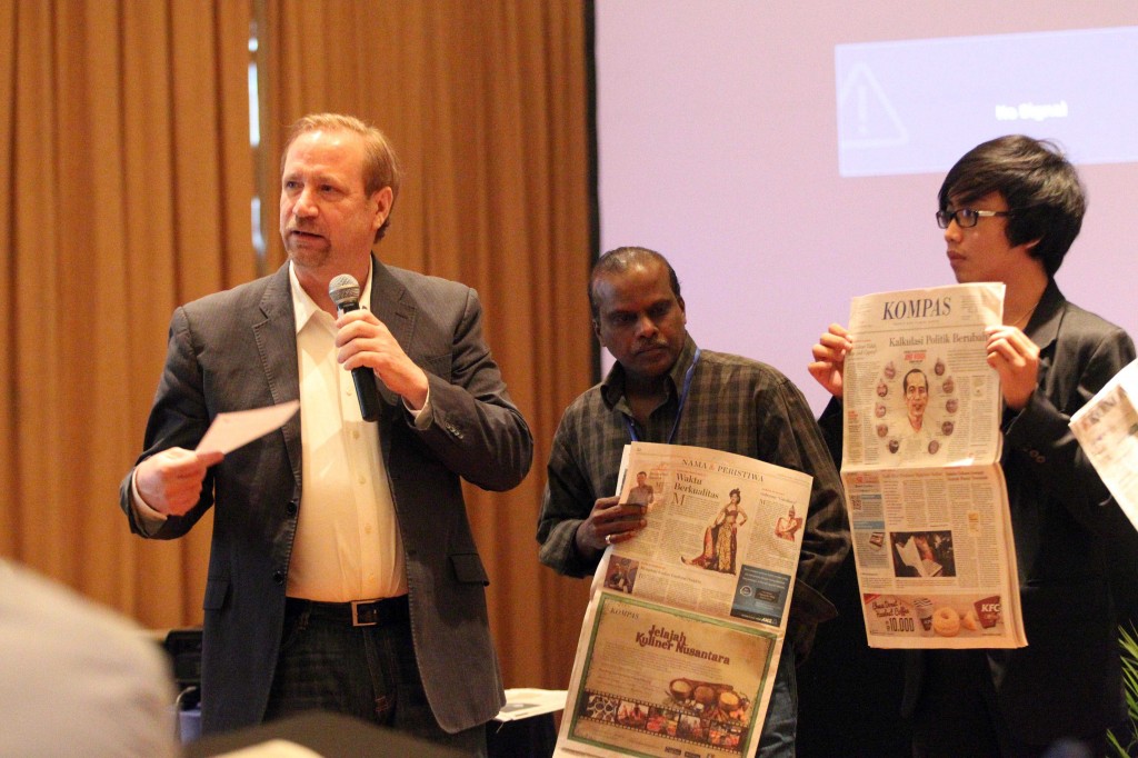
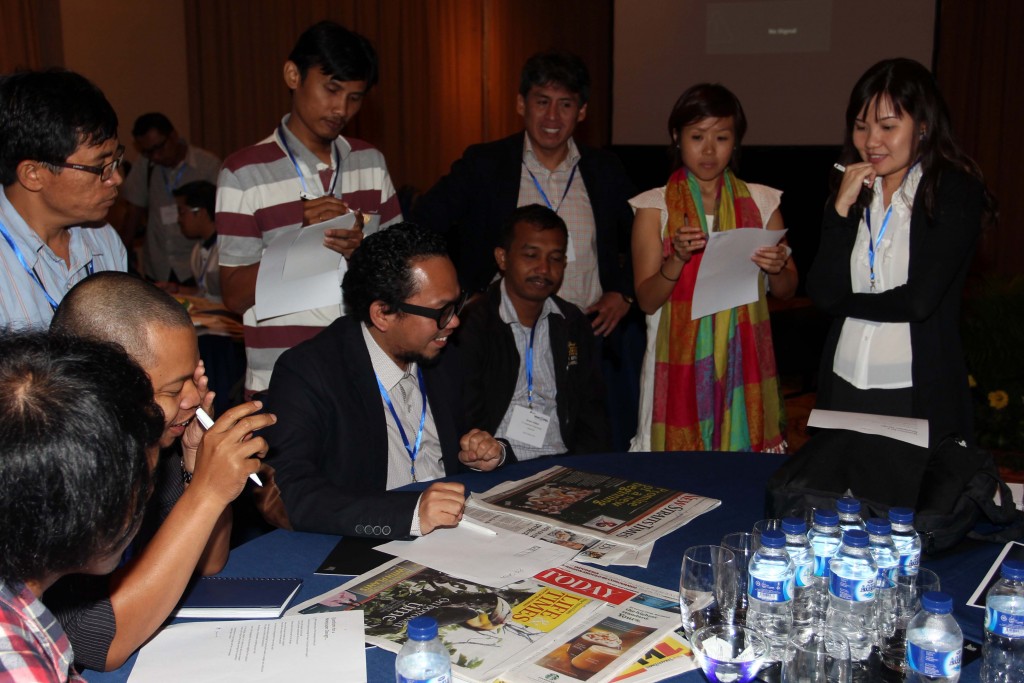
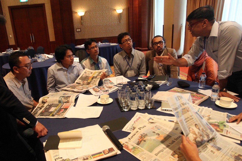
Many came to listen to the keynote speakers, of course, but I had the distinct impression that what excited people most was the prospect of getting candid feedback from international news design practitioners at the daily workshop sessions (see images below). I was impressed by the way people actively asked for and bravely handled feedback.
The speakers
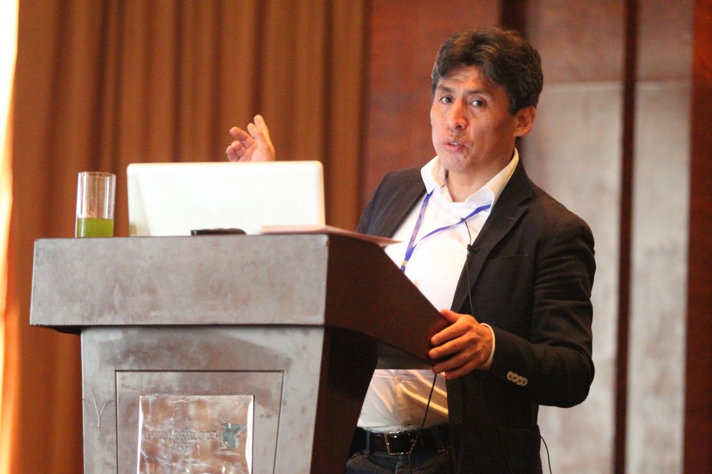
The conference’s line-up of speakers was led by two big names in news design: the internationally recognised experts Peter Ong (newspaper consultant, Checkout, Australia) and Hans Peter Hanisch (newspaper consultant, Germany). While Peter discussed the importance of good visual journalism overall and also held a session on the dos and donts of tablet design, Hans Peter focused on newspaper redesigns and what makes them tick. Both are subjects of high importance, but the realities on the ground are often in a different league to the examples discussed in these talks, which can leave the audience feeling a little daunted. Having said that, I like the approach, highlighted by Hans Peter, of proposing ideal prototypes, from which you can derive a better real-life product, even if it falls short of the archetype.
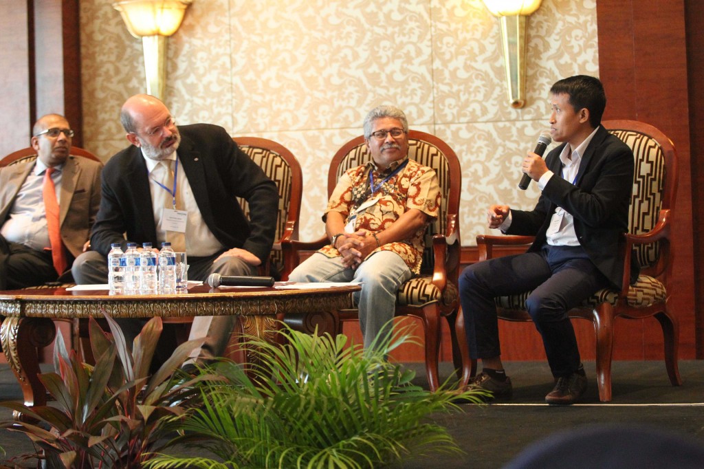
Hans Peter Hanisch moderates a panel on visual journalism in Indonesian newspapers at the 2013 News Design Asia conference.
The workshops
The entire third day was dedicated to hands-on workshops, where participants could submit projects for detailed critique.
Stephen Komives (executive director of the Society of News Design, USA), represented not just a great speaker, but also the alliance between WAN-IFRA and SND, the two industry bodies that joined hands once again to host the conference. His sessions put things into a global context and provided an array of inspiring bench marks, even though, it must be said, many of them remain unattainable for the majority of Asian news media for the time being. This is especially true for digital media, which remain a comparatively low priority for many newspapers, as print circulations and ad revenues continue to grow in this region. Of the few who have made a start on the digital front, many are from the Arab Gulf countries – including Al Jazeera (Qatar), Al Arabiya (Saudi) and my employer, Al Bayan (UAE).
Bill Gaspard (Art Director, China Daily, China) presented some examples of impressive work being done in China and how news design can play an important role in a rapidly changing society.
The verdict
Looking back over the work on show over the three days, there has been a marked progress in layout standardisation and unified branding efforts. At the same time, some newspapers presented a multitude of eye-catching, but somewhat excessive layouts. While most newspapers only feature the occasional magazine-style ‘designer spread’, some of them seem to print so many ‘exceptions’ that design templates and page navigation can get lost. Again, this dazzling variety of layouts is not always a bad thing; in many ways it reflects the vibrancy of Asian cultures and aesthetics. There is also a sense that an environment of tough competition can result in attempts to try to seduce the reader with ever-changing colours, shapes and surprises.
Another key observation for me was the realisation how far design thinking has now permeated Asian newsrooms. Basic design principles – how to use icons, photos and graphics, for example – are now so much more widely adhered to than even five years ago. Also heartening was the great interest many journalists showed in the topic of infographics overall and specifically in ways of integrating them in the daily grind of the newsroom despite a widespread lack of time and resources. Thankfully, there was nothing lacking in the enthusiasm, grit and curiosity of the journalists in attendance. A big thank you to everyone who came to share their experiences and opinions!

