Information released by national bureaux of statistics, such as census and economic data, are the bread and butter of data journalism. They are the cornerstones of international comparisons and a rich source of open data, especially in the U. S. and Europe, where all kinds of infographics, such as this interactive graphic by an American academic or these infographics by The Guardian, are created on the basis of such data sets.
In the UAE, however, the compilation and publication of rich statistical data is still a relatively novel concept, which, at times, makes our job extra challenging. There is no freedom of information legislation in place and it can be difficult to get access to even relatively basic information about both the public and the private sector. Forget about prickly issues such as crime rates and demographics; even seemingly ‘harmless’ subjects, such as the cost of a theatre production or sports event can be off limits. But perhaps this is unsurprising in such a young country, which, after all, only had its first full national census in 1975.
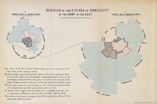
That was more than a century after Florence Nightingale presented her legendary Diagram of the Causes of Mortality in the Army in the East to Queen Victoria in a bold bid to convince her to reform the military healthcare system of the time, which seemed to kill more people than it was healing. Nightingale was one of the first people to use data visualisation to affect social and political change, and she did so against the advice of her statistical godfather, William Farr, who told her not to visualise the vast amounts of tabular data she had collected. But Nightingale insisted on making her message more immediate and palatable through visual means and came up with this now famous coxcomb graph:
Nightingale’s report was a turning point in medical history, ringing in the age of modern healthcare. Although it could be argued that a simple bar graph would have won over Queen Victoria just as well, Nightingale’s innovative use of graphs paved the way for today’s practice of using data visualisation to help people in power (and the general public) to make informed decisions. The fact that data has never been more public or well-presented than now, is a direct consequence of the ground-breaking work of Florence Nightingale and other Victorian pioneers, such as William Playfair, Adolphe Quedelet and John Snow. It is in their footsteps that national bureaux of statistics and other publishers of official data walk today.
The good news for visual journalists in the United Arab Emirates is that there are now a number of initiatives to promote the sharing of data collected by government entities. Over the past years, we have had the pleasure of working with two of the key drivers in this field: the UAE National Bureau of Statistics (NBS) and the Dubai Statistics Centre (DSC). You can imagine our excitement at being able to get to know the people behind the numbers first hand.
Both on the federal level and the emirate level, it was great to see these teams being passionate about what they are trying to achieve and working extremely hard to promote standardised data collection methodologies, collate huge data sets of variable quality and determine which data to release and in what form to present it. They are making a start on what will be a long road to catch up with international benchmarks. However, compared to other countries in the Middle East, the UAE are ahead of the game already.
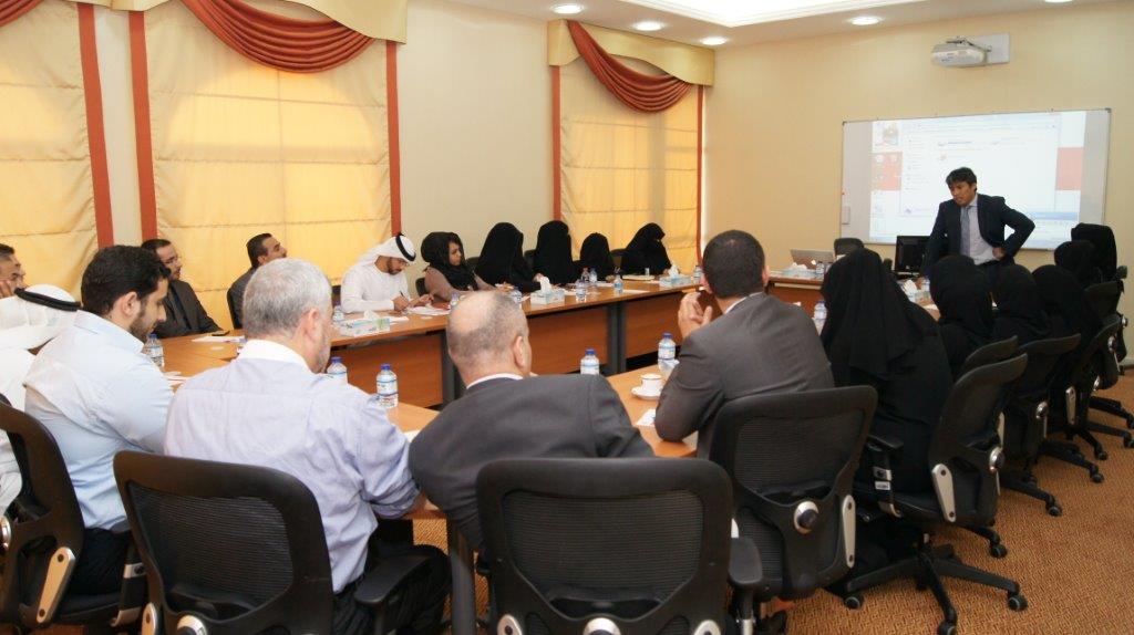
A year ago, we held a two-day data visualisation workshop for the NBS, which quickly turned from a lecture into a hands-on live tutorial, as the participants were eager to get as much practical advice as possible. Here is a snapshot from one of the sessions:

With the man behind the training, HE Rashid Khamis Al Suwaidi, Director General of The National Center. All the time devote all efforts to provide the most quality and up to date statistical services to all users in UAE.
Dubai Statistic Center, we are here!!
Our cooperation with the DSC, on the other hand, took the form of an extended infographics project. Weeks of collaboration led to the creation of a series of posters based on their latest statistical output, which you can see below. Initially, the aim was to produce just these three posters, providing an overview of Dubai’s workforce in 2012. Here they are:
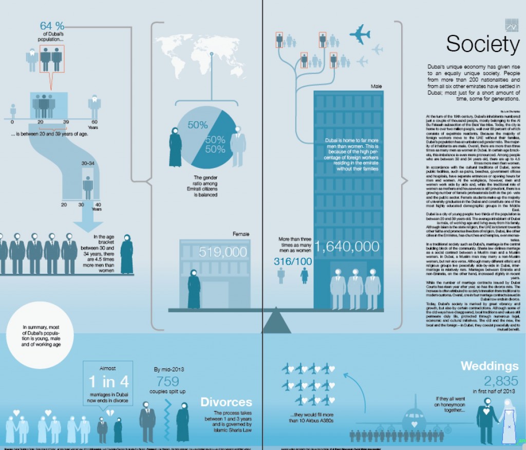
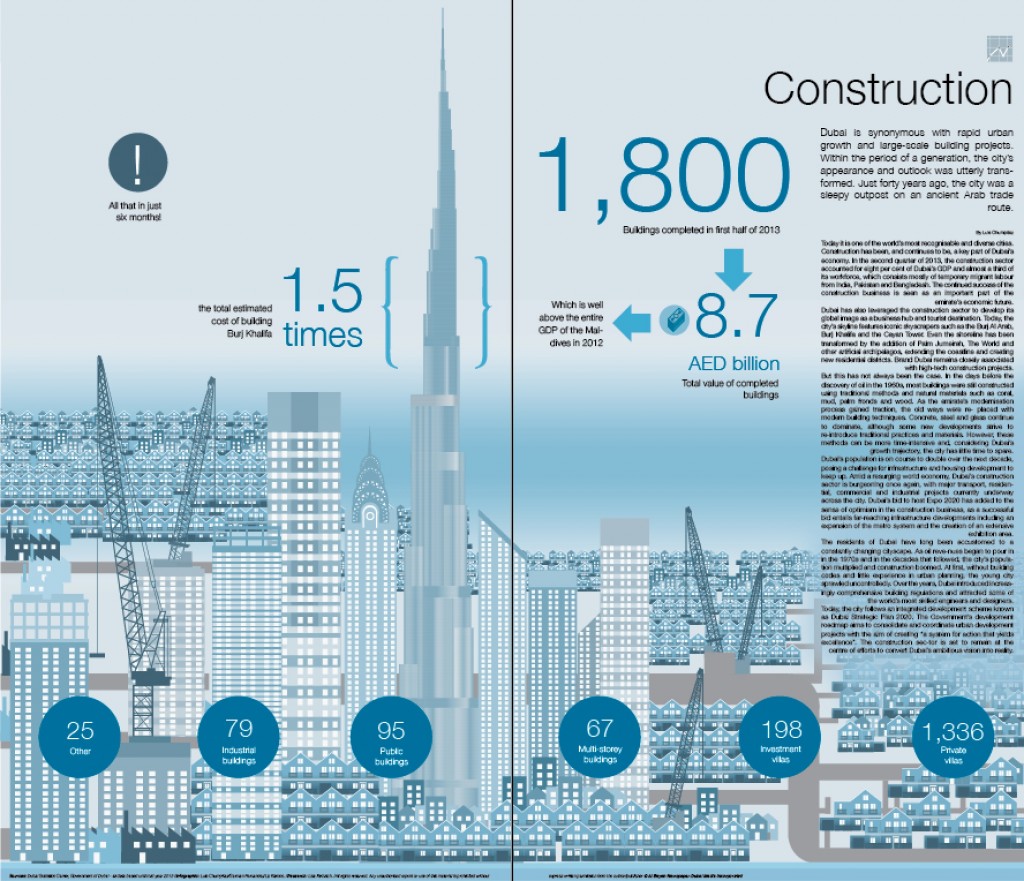
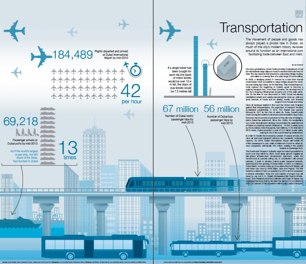
By the time these three were completed, the DSC also kindly provided exclusive access to as yet unreleased data on a variety of subjects, this time up to mid-2013 – an offer we obviously couldn’t turn down. Based on the materials released to us, we went on to produce the following four posters:
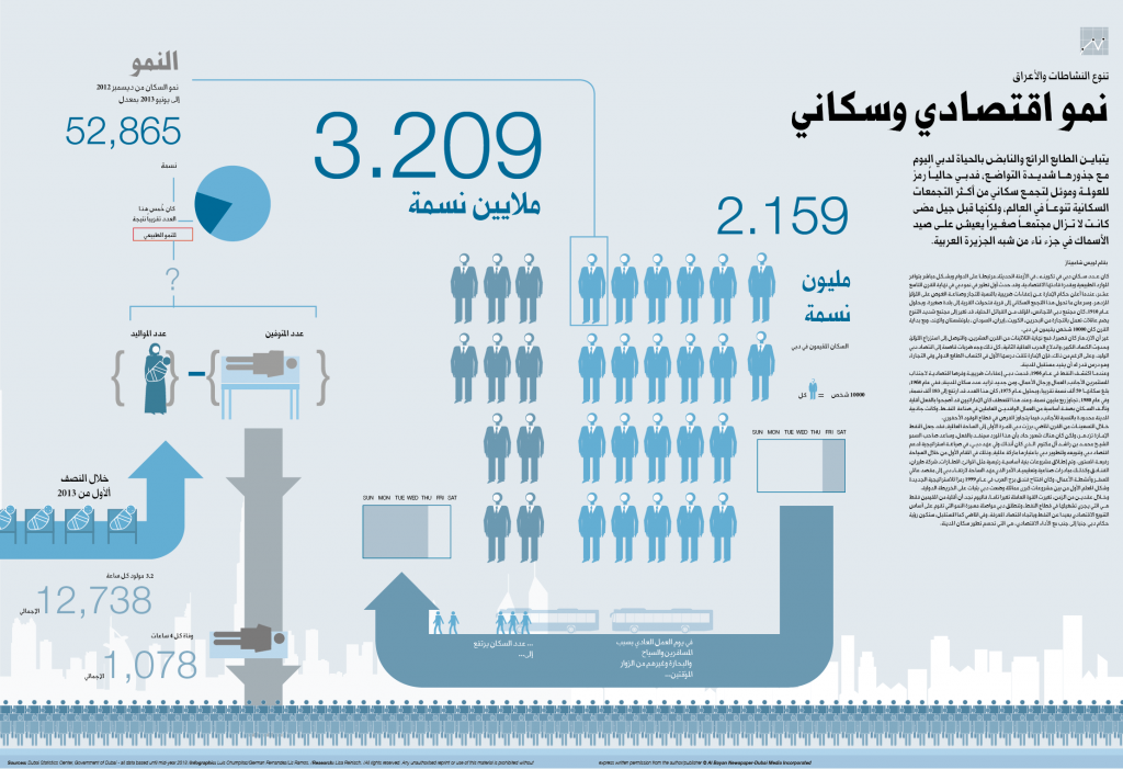
One on the latest population figures (here is the Arabic version):
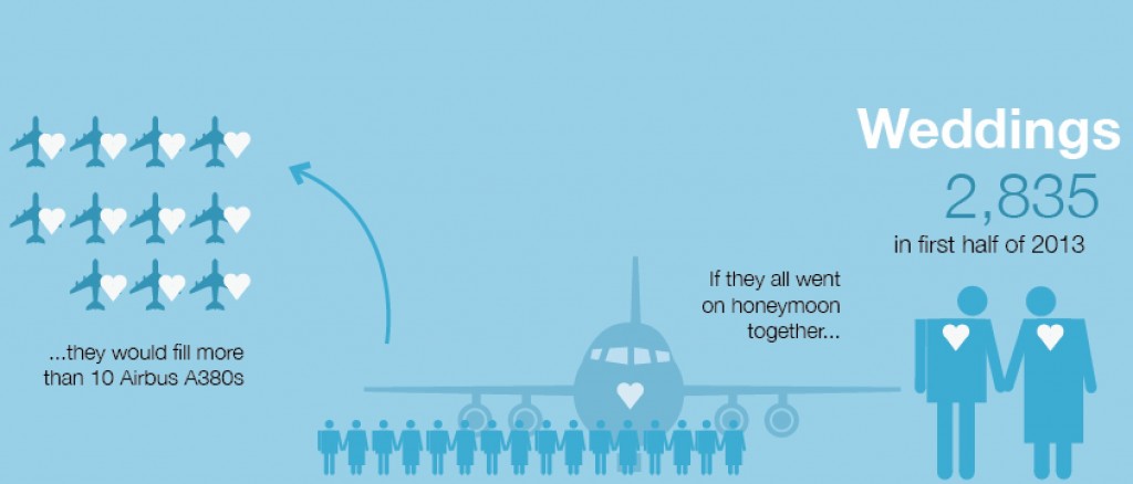
One on social indicators:
On the construction sector:
And, last but not least, our take on Dubai’s transport industry:
Working directly with the DSC team to create a statistical sketch of Dubai was both fascinating and effective. So much so, that we are currently working with them on a new, even more comprehensive project to showcase the incredible wealth of data they have at their fingertips. Watch this space!

