Do you read me?
Up until relatively recently, words ruled public discourse in the form of writing and speech. The appearance of television and digital media changed this. In some areas, especially popular culture and news, the relationship between words and images even flipped, making images the dominant form of communication, to the point where the written word is in need of protection, as evidenced by campaigns like ‘I pledge to read the printed word’ (aimed at adults) and Words for Life (aimed at children).
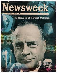
The rise of visual culture has much to do with the digital revolution and globalization, which have made effective communication across cultural and linguistic barriers more important than ever. Since the 1930s, a number of designers and academics have embarkes on the ambitious quest to develop a visual lingua franca. Inspired by similar hopes (world peace) and worries (Wold War III) as the originators of Esperanto and other auxiliary languages, they asked themselves: what if a language system comparable to Esperanto could be established for visual communications? An audacious idea; but one endorsed by none other than Marshall McLuhan:
Marshall McLuhan: Culture Without Literacy, 1953“The language of visual form is, therefore, one which lies to hand as an unused Esperanto at everybody’s command. The language of vision has already been adopted in the pictograms of scientific formula and logistics. These ideograms transcend national barriers as easily as Chaplin or Disney and would seem to have no rivals as the cultural base for cosmic man.”
All languages, whether based on words or images, are socio-cultural constructs and are therefore unfixed, always in evolution and open to interpretation/misunderstanding. Both image and word are imprecise representations of intellectual, emotional and physiological phenomena – IE thoughts, feelings and sensations. The philosopher John Locke claimed at the end of 17th century: “As the main objective of language in communication is to be understood, words are not suitable for this purpose.”
What would such a ‘language of vision’ look like?
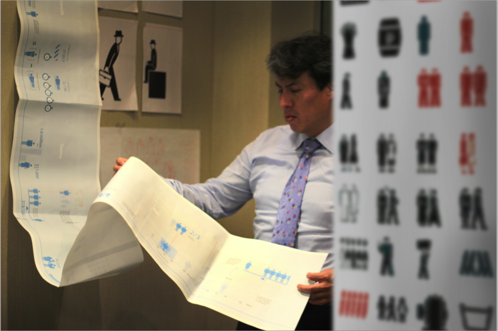
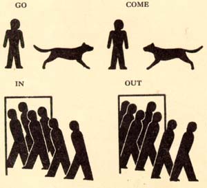
Perhaps the best-known attempt to answer this question (among infographists, at least) came from the Austrian philosopher and economist Otto Neurath (1882-1945), a member of the Vienna School and a pioneer in the field of information visualization. His system of representing quantitative information via easily interpretable icons (such as the one pictured above and at the top of the blog post) has been key for the development of modern infographics. His efforts resulted in the creation of nearly two thousand pictographs – so-called Isotypes – aimed at bringing ‘cold’ statistics to life in order to aid communication between nations and to educate the (widely illiterate) masses. They were also designed to convey socialist politics, acting as a highly effective tool of propaganda. One of Neurath’s catch-phrases was: “To remember simplified pictures is better than to forget accurate figures”.
Another, more contemporary universalist is the Dutch information architect Paul Mijksenaar; he of the elegant and globally understood signposting at various airports. Mijksenaar has been exploring the possibilities and challenges of a visual Esperanto for years. His work is based on the realisation that, as increasing numbers of people travel the world, the need to overcome communication hurdles are becoming increasingly important. His agency’s user-friendly color-coded signage helps travelers navigate some of the world’s busiest airports.
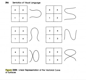
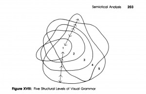
Some of the more academic attempts to create image languages have yielded interesting, although unwieldy results. In the 1980s, when the rise of visual culture was in full swing, the Canadian writer and academic Fernande Saint-Martin tried to apply the rules of semiotics to visual communications. In effect, she imagined a possible grammar for visual signification. Here are two diagrams from her book Semiotics of Visual Language, based on basic building blocks called coloremes:
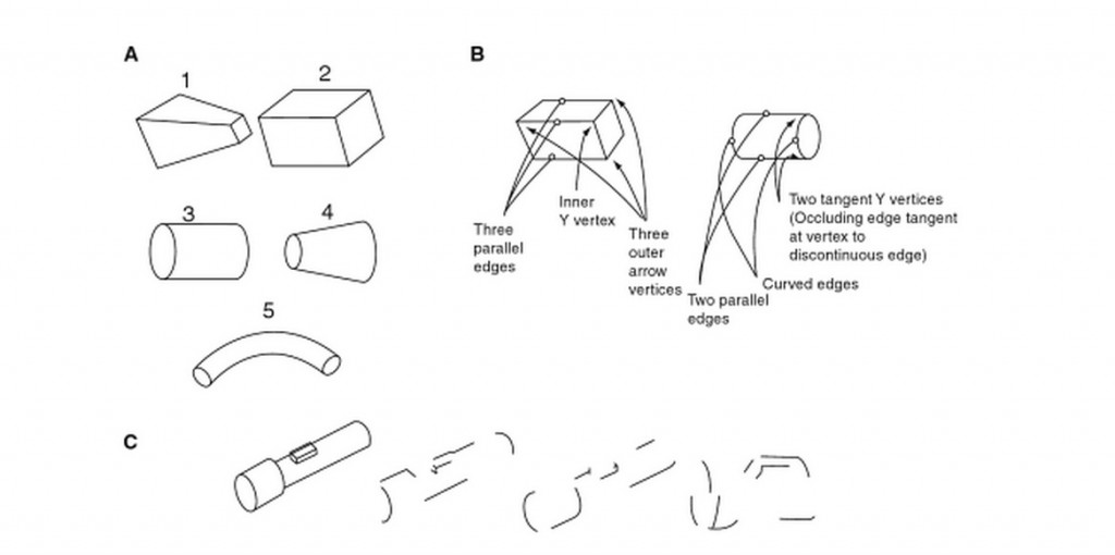
In the 1990s, Irving Biederman, professor of neuroscience and psychology at the University of Southern California, experimented with object recognition and proposed an alphabet of objects, made up of simple 3D shapes called ‘geons’. Biederman found that almost every object can be reduced to two or three such geons (pictured below), which, if combined, can be recognised by most people.
All this theorising goes to show that the immense communications potential of images has been keeping thinkers thinking. Whether you have a pragmatic interest in global communications or idealist dreams of world peace, the idea of being able to convey complex meanings in the blink of an eye to audiences all over the world remains fascinating.
But images have their limitations, too. Media philosopher Frank Hartmann wrote in 2006: “To ‘represent things’ then, is not possible without a certain bias towards what nowadays must be called “faitiche” – or factish, a combination of fact and fetish (Latour 1999) – indicating the crucial element of fabrication inherent in the pictures. This is an obvious problem in contemporary media production and with the increased role of the imaging in science, that is, the increasing dependence on illustrations because of the widespread use of computer graphics.”
Hartmann goes on to describe the legacy of Neurath’s inanely ambitious ‘International Picture Language’, with its many rules on how to construct and use signs: “[they] offer a kind of information aesthetics, which allows quick navigation based on intercultural commonsense – they constitute a streamlining for easy judgement and a new technique for accessing content.”
This may fall short of the exalted goals set forth by the forefathers of auxiliary languages. Neurath et al aspired to change the world of communications, not just improve information design. Perhaps an effective, popularised Visual Esperanto has not emerged so far because images simply can’t be squeezed into a grammatical straightjacket. Nonetheless, the quest for a Visual Esperanto remains ongoing and has inspired some truly mind-bending, beautiful contributions to visual culture over the years.
What is your view on this? Do you think the idea of developing a universal visual language is an illusion or could it be achieved one day? Is it even necessary? Would love to hear your thoughts.

